HOME PORTRAIT

Before and After
Intuition and Collaboration Pays Off in West Tisbury
By Amelia Smith, Photography by Bob Gothard
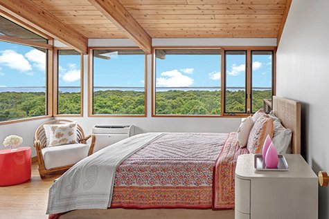
The view is spectacular, but the house lacked curb appeal – a building old enough to show its age but without antique charm. It looks out over a long sweep of the Vineyard Sound, across Lambert’s Cove, all the way to the Elizabeth Islands and beyond, a perfect place to watch boats sailing across the water into the sunset. For Tracy Gardiner and her husband, who bought the house two years ago, it was perfect. “I love modern style houses, I think they’re very cool,” Tracy says. “We were excited to find one on the Island, that’s why I didn’t want to tear it down.” Tracy, her husband, and their children had spent their first few summers on the Vineyard renting in Katama, then they rented a summer house in Makonikey and fell in love with the area.
Real estate agent Kate Gothard, of Kendall & Kendall Real Estate worked with the couple on the sale and helped them to find a contractor to do the renovation. Kate recommended Doug Best. “I thought it was a great house,” Kate says. “Lambert’s Cove was an area they really liked, so that was a deciding factor.” However, the house very much needed renovation. Its wood ceilings had been pickled, the deck was rotting, and the kitchen badly needed an update, to name a few of the issues.
For contractor Doug Best of D. Best Construction & Painting, the renovation was a challenge, which drew on his deep experience in renovating older homes. “I’m not the biggest contemporary guy,” he says. “I started in renovations, and I love the craftsmanship in the historic houses. Most of the contemporaries on the Island are newer and architect-driven. The older contemporaries are starting to come back to life, like this one.” John Early of West Tisbury originally built the house, probably in the 1970s. The house was heavily used and was enjoyed tremendously by its previous owner, so Doug’s work was cut out for him. “It was funky. We took a diamond in the rough and gave it its true luster.”
“This was not an off-Island project, not a New York City project,” Doug says. His company and other Island contractors completed the work. The house needed to be brought up to current code, and Doug says that Best Electric – no relation to him – did a miraculous job in hiding the wiring. The frame was solid and the exterior trim and windows were all made out of mahogany, which is very rare, Doug says. The rest of the trim was cedar and all of the interior doors were fir doors. “We kept all the original doors and refinished them all,” Doug says. The floors of the upstairs were made of solid planks, the Before underside of which were the ceilings, downstairs. These, which were stained and pickled, had to be sanded down to bring out the beauty of the wood, which made for a lot of work for Doug’s painting team.
“Our own paint division, D. Best Painting, tackled the project from A to Z, refinishing all the ceilings and all the wood, as well as doing all the painting,” Doug says. The paint has different shades and lusters of white, and this fine attention to the finishes captures natural light coming in from the ocean and sky. Doug’s team refinished the wood floors upstairs. Downstairs, there was rough-cut, irregular slate in the entry, carpet in the bedrooms, and linoleum on the rest of the floor. They replaced all of that with large rectangular gray tiles, offset to create a gentle sense of flow.
“As for Doug’s team, I can’t say enough about all of them,” Tracy says. “I’ve renovated so many homes, and they’re just a great team and he is so responsive. He does what he says he’s going to do. They really work with you.” Tracy’s career has been in retail branding (she serves on the Boards of Directors of Croc and Gap Inc.), which has given her a keen design sense, so she knew what she wanted. “I wanted a Scandinavian, very clean, Zen design,” she says. “I did a lot of research, and I worked very closely with Doug’s team.” With local interior designer Erin Ritchie at R+D Studio, Tracy sought out pieces that would bring out the house’s potential, furniture at Vineyard Decorators, art at the Granary Gallery and Field Gallery, and tile from Martha’s Vineyard Tile Company in Vineyard Haven.
“We love to cook, we love to entertain,” Tracy says. “The layout took into consideration gathering, playing games, and looking out at the sunsets.” The renovation kept the envelope of the building intact but there were some significant changes.
The ground level of the house has a bath, two bedrooms, and a den area, the main living space is upstairs from the entrance taking advantage of the views. Structurally, the biggest change was to open up the connection between the kitchen and the main living area. “We pulled out a partial wall and a knee-wall that separated the dining area and kitchen from the living room,” Doug says. That required a new steel beam for structural integrity. Once the beam was in place, they boxed it in with wood making it blend perfectly with the rest of the ceiling. The change gave the great room a much more open feel, giving it great water views from virtually every part of the second floor, including much of the kitchen.
Renovating the kitchen was a matter of upgrading the appliances and making a couple of small but significant changes to the basic layout. Amy Myer at Supply New England helped with plumbing fixtures for the bathrooms and kitchen, and the countertops in the kitchen and baths. Quartzforms replaced the aging white Formica countertops with Absolute White, and new white and stainless steel appliances replaced the old darkly-colored ones. The kitchen island was redesigned for more seating in a breakfast-bar style. They extended one counter the length of the room, and added a wine fridge below. An off-the-kitchen screened-in porch serves as a fair-weather dining room. Where there had been wall cabinets, the clean lines of floating shelves stand on white tile walls. The new cabinets are a custom stain on white quarter-sawn oak, in harmony with the house’s natural wood ceilings and details.
In the living room area, low-backed white sofas and lightly finished wood tables keep the living room décor clean and simple. Local art hangs on the walls and sits on side tables. There’s a new gas fireplace, which replaced the old wood-burning one, and a dining table to gather around when the weather drives guests indoors. Floor-to-ceiling windows and sliding doors along the North Shore side of the house lets light in, along with the views.
Erin Ritchie worked with Tracy to find the lighting fixtures that give the space focal points of interest. “It is easy to work with a client like Tracy because she has great taste and is design focused,” says Erin. “We were trying to achieve a ‘less is more’ aesthetic. We stayed very flexible in terms of where we thought we would put pieces, and we switched a few around once they were delivered. If we didn’t love it, we didn’t do it. We kept referring to it as the jewelry of her house.”
Outside, a wide deck runs the length of the house, which was only eight feet wide before the renovation. Doug and his team extended it to 12 feet, allowing more room for seating and room to relax. “We had to rebuild the deck entirely,” Doug says. “The main house beams were the same ones that held up the deck and were cantilevered out, the outdoor portions of them had rotted out. We cut them back and turned it into a new structure with mahogany posts and railing with stainless cable sides.” The new railings enhanced the view without getting in the way.
The renovations included transforming the home’s two bathrooms. In the hall between the primary bedroom and bath, Doug added a narrow linen closet in what had been dead space. The bathroom’s floor had been a step up from the main level of the second floor to accommodate plumbing. “Despite the single ceiling and flooring system on the second floor, we removed the elevated floor in the bathroom and made it all the same level as the rest of the floor by getting creative. We ran the plumbing to the primary bathroom in the ceiling above the first floor shower,” Doug says. Adding two skylights and reconfiguring windows above the vanity brought more light into the room. The vanity had a long outdated red Formica counter with a single sink and two windows above. Doug’s team replaced this with a Viatera Lumina quartz countertop with a pair of sinks at both ends and built-in deep closet shelves adjacent. Two round mirrors over the sinks with a single window in between give the area symmetry. The shower, previously boxed-in with glass, is now open with no lip, its white tile walls extend seamlessly to the ceiling.
In the downstairs bath, the original fixtures were a very dark blue color that did nothing to brighten the space. “The difficulty with the first floor was that the building is built on a concrete slab,” Doug says “All the plumbing is buried in the slab. It limited our ability to make any significant changes with the first floor bathroom and laundry.” Although the positions of the fixtures were locked in, everything else was upgraded. The walls now have circular white penny tiles that add a subtle visual interest throughout the room including the one foot-wide bands of colonial blue penny tile in the shower area. At the sink, a Kallista wall-mount faucet with cross handles extending directly from the wall, emptying into a sink basin that sits atop a freestanding vanity.
Tracy and her family have been enjoying the house, and had a great first summer. “We had lots of friends come, and family too,” Tracy says. “It’s just wonderful, to us, it’s a magical place. We definitely test-drove it this summer and it all worked. It’s small, but small is better.” Still, there’s always more to do. Tracy is working out how to best use the downstairs den area, and what to do with the landscaping around the house. The drought this summer meant that the grass they planted did not do well. Tracy is now looking for ground cover that will tollerate less water. “It’s simple and natural, and that’s what we love about West Tisbury, too,” she says. Meanwhile, she can sit back and enjoy the view in graceful modern style.
To find out more about D. Best Construction & D. Best Painting click: dbestconstruction.com, e-mail: dougb@dbestconstruction.net, Phone: 508-737-3278 To find out more about R+D Studio click: rdstudiomv.com, e-mail: erin@rdstudiomv.com, Phone: 508-360-1830


